Content Analysis of a Facebook Group Using R

Author: Ilan Dan-Gur
Date of publication: December 28th, 2020
Date of statistical data: December 16th-22nd, 2020
I used data mining [1] to analyze the content of posts in a facebook group in the Bow Valley, Alberta, over a one-week period (in December, 2020). The analysis was done using R (a language for statistical computing and graphics).
I will start by displaying the results, followed by a detailed description of how the analysis was done including the data file and the R code used to produce the results.
Results
Type of posts
- 34.8% Looking for help (e.g. asking a question, looking for recommendation)
- 15.2% Supporting a cause (e.g. buy local, holiday celebrations, donations for the less fortunate)
- 15.2% Providing info
- 9.8% Promoting a specific business
- 7.1% Covid related
- 6.2% Lost and found
- 6.2% Complaint about an issue
- 4.5% Thank you note
- 0.9% Reporting vandalism
List 1: Proportions of posting types
Comparison between groups
A bar chart comparison between two groups of the three most common types of postings.
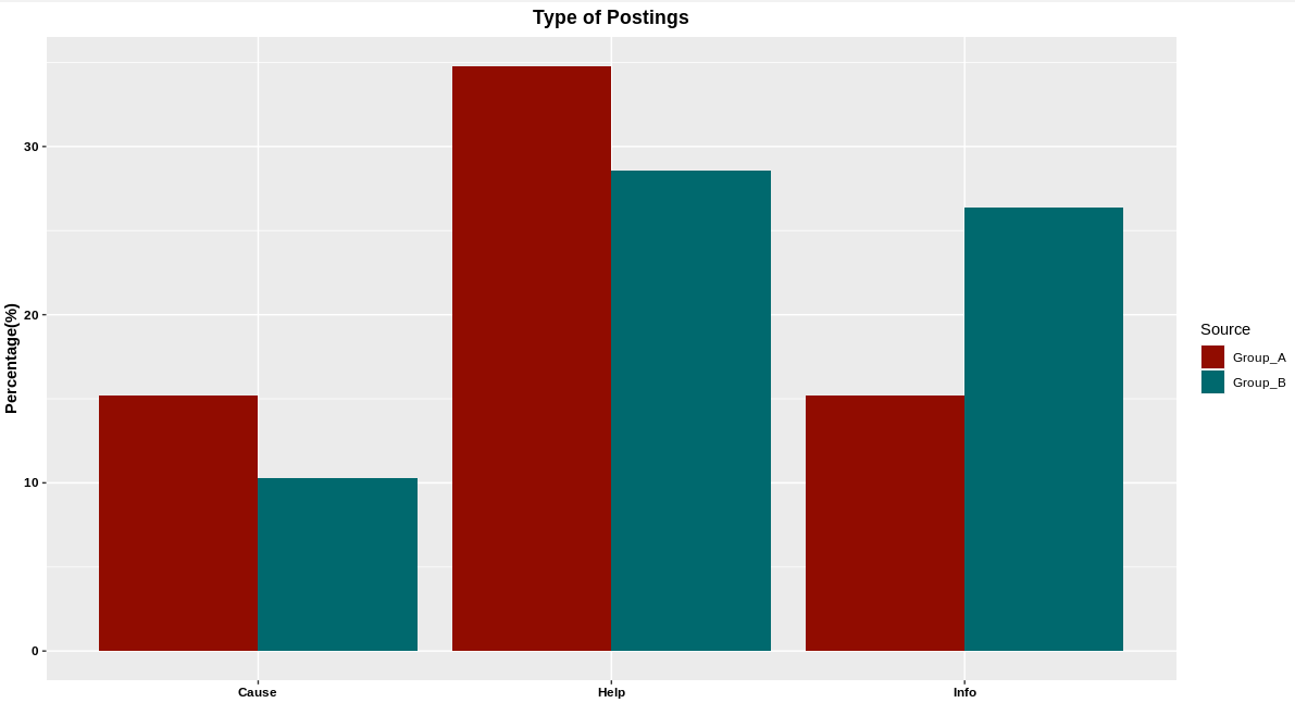
Graph 1: Comparison of proportions of posting types between two facebook groups
Most frequent words used
- Canmore
- Christmas
- Know
- Please
- Valley
- Banff
- Bow
- Thanks
- Covid
- Looking
- Need
- Parks
- Today
- Free
- Get
- Town
- Year
- Back
- Family
- Time
List 2: Most frequent words used
One week in one image
The software automatically created an image of a "word cloud" [2] that included many words used in the posts. The most-frequent words are the largest and at the center of the image. The less-frequent words are smaller and at the edge of the image. Obviously, the least-frequent words were not included due to space limitations.
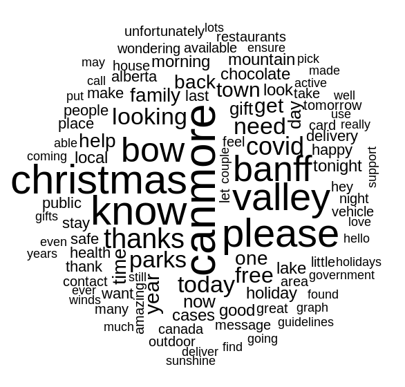
Image 1: A word cloud of the most-frequent words used
How the analysis was done
1. Data collection and preprocessing
I collected posts from a facebook group in the Bow Valley, Alberta, over a one-week period (in December, 2020). The messages were saved as anonymous – only the textual content of the posts without names.
The data was organized in a CSV file containing two features: "type" and "text" (the data file can be downloaded here [3]).
The facebook posts were included in the "text" feature (see data file).
Each post was identified manually as one of the following types:
- Business (promoting a specific business)
- Cause (supporting a cause, e.g. community)
- Complaint (complaining about an issue)
- Covid (covid related)
- Help (looking for help, asking a question, looking for recommendation)
- Info (providing info)
- Lost (lost and found)
- Thanks (thank you note)
- Vandalism (reporting vandalism)
2. Analysis: Proportions of posting types
(The code is in R programming language)
I began by importing the CSV data from the file (facebook.csv) and saving it to a data frame:
fb_raw <- read.csv("facebook.csv", stringsAsFactors = FALSE)
The "type" feature is currently a character vector. Since it's a categorical variable, I converted it to a factor:
fb_raw$type <- factor(fb_raw$type)
I then verified there were no identical (i.e. duplicate) posts in the dataset:
anyDuplicated(fb_raw$text)
The anyDuplicated() function returns "0" if no duplicates exist. Otherwise it returns the line number of the first duplicate posting. To remove a duplicate posting (say, the 4th) you can use:
fb_raw <- fb_raw[-4,]
Next, I calculated the proportions of posting types, and sorted the results in decreasing order:
sort(round(100*prop.table(table(fb_raw$type)), digits = 1),decreasing = TRUE)
Which resulted in the following percentage output (displayed also in list 1 above):
Help 34.8
Cause 15.2
Info 15.2
Business 9.8
Covid 7.1
Lost 6.2
Complaint 6.2
Thanks 4.5
Vandalism 0.9
3. Visualization: Bar chart
I used the "ggplot2" package/library to create a bar chart comparison of the three most common types of postings between that facebook group (group A) and a fictitious facebook group (group B):
Group A
- 34.8% Help
- 15.2% Cause
- 15.2% Info
Group B
- 28.6% Help
- 26.4% Info
- 10.3% Cause
Here is the R code for all that:
install.packages("ggplot2")
library(ggplot2)

Group_A <- tribble(
  ~Type, ~Percent, ~Source,
  "Help", 34.8, "Group_A",
  "Cause", 15.2, "Group_A",
  "Info", 15.2, "Group_A"
)

Group_B <- tribble(
  ~Type, ~Percent, ~Source,
  "Help", 28.6, "Group_B",
  "Info", 26.4, "Group_B",
  "Cause", 10.3, "Group_B"
)

typeAll <- rbind(Group_A, Group_B)

p <- ggplot(data = typeAll) +
  geom_bar(mapping = aes(x = Type, y = Percent, fill = Source), stat = "identity", position = "dodge")

p + ggtitle("Type of Postings") + theme(plot.title = element_text(hjust = 0.5, colour = "black", face="bold"), axis.title.x=element_blank(), axis.title.y = element_text(colour = "black", face="bold"), axis.text.x = element_text(colour = "black", face="bold"), axis.text.y = element_text(colour = "black", face="bold")) + ylab("Percentage(%)") + scale_fill_hue(l = 30)
The bar chart is displayed above as graph 1.
4. Cleaning the text
I installed the "tm" (Text Mining) package/library, and used it to:
- - Change the text to lower case
- - Remove numbers
- - Remove standard filler words (e.g. any, in, the, with), including my own custom list, from the dataset
- - Remove punctuation
- - Remove white spaces
Here is the R code for all that:
install.packages("tm")
library(tm)
fb_corpus <- VCorpus(VectorSource(fb_raw$text))
fb_corpus_clean <- tm_map(fb_corpus,content_transformer(tolower))
fb_corpus_clean <- tm_map(fb_corpus_clean, removeNumbers)
exFillerWords <- c("will","anyone","can","like","just","new","also","everyone")
fb_corpus_clean <- tm_map(fb_corpus_clean,removeWords,c(stopwords("english"),exFillerWords))
replacePunctuation <- function(x){gsub("[[:punct:]]+"," ",x)}
fb_corpus_clean <- tm_map(fb_corpus_clean,content_transformer(replacePunctuation))
fb_corpus_clean <- tm_map(fb_corpus_clean, stripWhitespace)
5. Analysis: Most frequent words used
I used the tm package (see step 3 above) to split the facebook postings into individual words. I then summed up how many times each unique word was used across all postings. Finally, I found the most frequent words and sorted the results (i.e. the list of most frequent words) in decreasing order.
The 20 most frequent words are displayed in list 2 above.
Here is the R code for all that:
fb_dtm <- DocumentTermMatrix(fb_corpus_clean)
freq <- colSums(as.matrix(fb_dtm))
sort(freq[findFreqTerms(fb_dtm,5)],decreasing = TRUE)
6. Visualization: Word cloud
I installed the "wordcloud" package/library, and used it to create an image of a "word cloud" that included many words used in the posts.
The image is displayed above as image 1.
Here is the R code:
install.packages("wordcloud")
library(wordcloud)
wordcloud(fb_corpus_clean, min.freq = 5, random.order = FALSE)